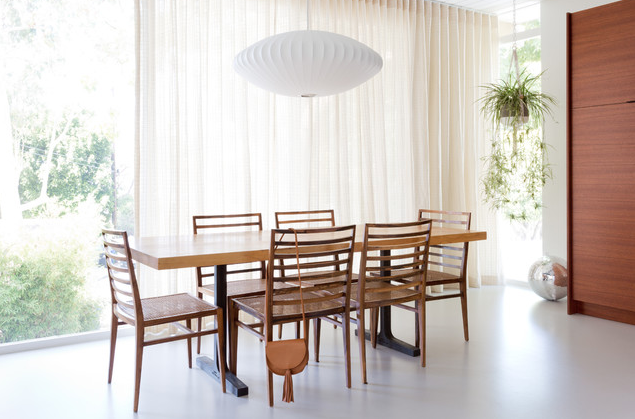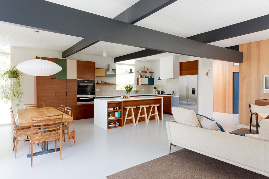
Project by New Generation Home Improvements
A major trend in today’s design is a new take and spin on Mid-Century Design. Now if your wondering what exactly this modern version of Mid-Century design looks like stay tuned as we walk you through the look and feel
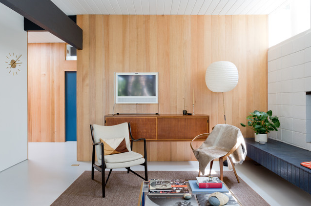
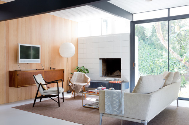
So, what is Mid-Century Modern architecture and design? Picture a house made of straight lines with curved edges. The roofs of these types of houses are mostly flat, but you can still see a few homes that have gable roofs. The interior is designed with an open floor plan, allowing open flow throughout the rooms. Which brings us to the wall structure, there might not be too many walls given that it’s an open floor plan, but when there is a wall it can be a partial wall giving more depth to the space. These homes also tend to have giant sliding-glass doors and large windows, giving natural light access to enter each room. If there are stairs in the home, they are small steps and sometimes designed in a spiral style.
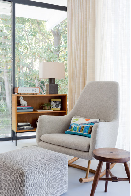
Mid-Century Modern architecture designs and furniture styles are from the mid-20th century, originating in America between 1933 – 1965. The furniture is also very similar to the design of the house; straight, clean lines with smooth and curved angles. Normally there is no fancy upholstery or style, just the basic clean look.
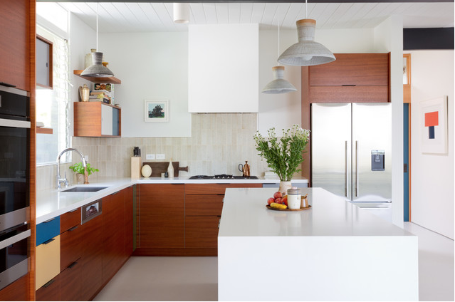
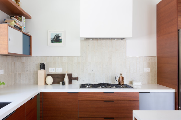
When it comes to a Mid-Century Modern wall, there are a few options: wallpaper, paint and wood covered seem to be most common. For wallpaper there are a lot of patterned designs, some no more than 3 colors. Then there are the paints varying from whites, creams or light greys for rooms that need to feel spacious. The popular bold statement colors are greens, teals, and oranges.
Like the walls, the floors in a Mid-Century Modern home also have many options but in general are very clean. Although Epoxy floors can be delicate it creates a clean and simple look. For wood floors, the narrow plank hardwood floors live up to the era. If you are looking for tiles for the kitchen, you would go with large-scale tiles. The tiles should stay in the natural color tone: white, beige, gray, and/or black. If you decide on carpet, choose neutral colors with tight knotted styles to give it a subtle texture.
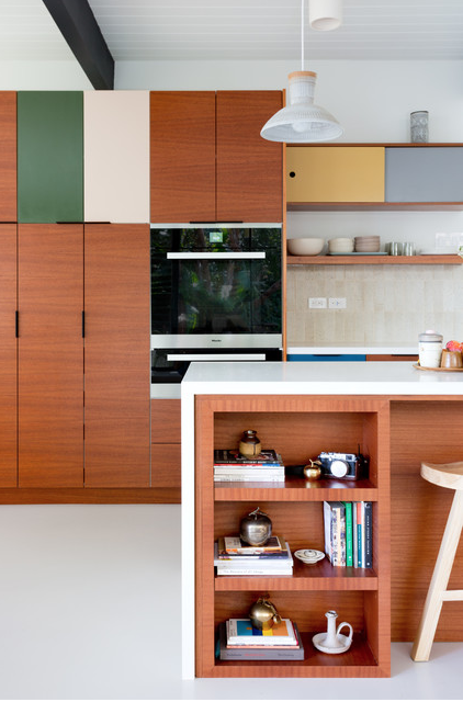
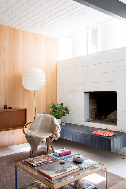
Saving the best for last, the kitchen. To keep the flow of the Mid-Century Modern motif, we need again clean straight lines, with light-colored wall, accents in pastel colors, flat paneled cabinets, and appliances with retro rounded corners and shiny metal handles. Try a pale green or blue walls, to go great with either a white or light wood cabinetry, and retro style light fixtures. Wrap up the whole look with similar kitchen furnishings, such as: chairs, a clock, and vases. Now that’s improvement!

